
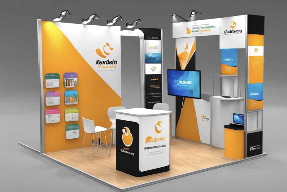
Exhibiting at a trade show or industry exposition requires a significant investment of time, labor, and budget. However, many businesses struggle to stand out in crowded exhibition halls, failing to attract qualified leads or leave a memorable impression on prospective clients. When an event booth feels disorganized, cluttered, or difficult to read from a distance, attendees simply walk past without engaging.
Designing an effective exhibition booth requires a clear understanding of visual hierarchy, spatial flow, and material choices. Educational resources provided by AlphaGraphics Brentwood demonstrate that structuring display typography into distinct visual height zones allows attendees to absorb core brand messaging within three seconds of approaching a booth. Taking a deliberate, strategic approach to exhibit design transforms a passive display into an active lead-generation space.
1. Establishing a Clear Visual Hierarchy
Attendees navigate crowded trade show aisles quickly, scanning dozens of booths per minute. Your display graphics must communicate instantly, guiding the viewer’s eyes naturally from high-level branding down to specific product details.
Top Zone: Long-Range Visibility (8 Feet and Above)
Your highest graphic elements should focus exclusively on immediate brand identification. Use large logos, high-contrast colors, and bold, simplified typography. Avoid putting long sentences or small details at this height, as they become unreadable from across the aisle.
Eye-Level Zone: Mid-Range Value Messaging (4 to 7 Feet)
This is the primary viewing area once an attendee stops in front of your booth. Focus on your core value proposition—the specific problem your company solves. Use concise headlines, short bullet points, and high-resolution imagery that communicates your solution immediately.
Lower Zone: Supporting Information (Below 4 Feet)
The lower section of your display panels is frequently blocked by counters, product tables, or standing people. Reserve this area for background colors, decorative patterns, or minor secondary graphic elements rather than critical text or call-to-action details.
2. Choosing the Right Display Structures and Materials
Selecting appropriate display hardware depends on your travel frequency, booth dimensions, and setup capabilities. Matching the material to your operational needs ensures your display looks professional and survives multiple events.
| Display Type | Key Advantages | Best Use Case |
| Pop-Up Tension Fabric | Lightweight, wrinkle-resistant, fast assembly | Frequent travelers and single-person setup teams |
| Modular Panel Systems | Highly customizable, durable, reconfigurable | Medium-to-large booths requiring built-in TV mounts or shelves |
| Retractable Banner Stands | Highly portable, compact, budget-friendly | Accent messaging, entryway directionals, and small footprints |
3. Optimizing Layout and Traffic Flow
A common mistake in booth design is placing a large counter or table directly across the front entrance. This creates a physical barrier that discourages attendees from stepping inside your space.
- Keep Entrances Open: Position tables and demonstration counters along the back or sides of the booth footprint to create an inviting, open walkway.
- Create Designated Zones: Divide your floor plan into distinct areas: a welcoming entryway, a product demonstration space, and a quiet area for deeper conversations.
- Incorporate Interactive Elements: Use touchscreens, live product samples, or tablet stands to give visitors a reason to linger inside the space.
4. Master Lighting and Typography for Readability
Exhibition halls often suffer from dim overhead lighting or harsh fluorescent glare. Bringing your own dedicated lighting completely changes how attendees perceive your booth graphics.
- Use Direct Spotlight Focus: Mount LED arm lights along the top rail of your display walls to illuminate core headlines and eliminate shadows cast by hall lighting.
- Select High-Contrast Color Combinations: Dark text on light backgrounds or bright white text on dark backgrounds delivers the highest readability. Avoid subtle color gradients or low-contrast pairings like yellow text on white.
- Keep Fonts Clean and Sans-Serif: Use simple, bold typefaces like Helvetica, Arial, or Montserrat. Script and overly decorative serif fonts become unreadable under fast-walking conditions.
5. Pre-Event Testing and Inspection Routine
Setting up a trade show booth for the first time on the event floor leads to unnecessary stress, missing hardware surprises, and misaligned graphics.
Conduct a Full Test Run
Assemble your entire booth structure at your warehouse or office at least two weeks before the show. Verify that all frame connectors click smoothly, tension fabrics fit without sagging, and all graphic panels line up perfectly along seams.
Packing and Transport Preparedness
- Store fabric graphics in padded protective bags to prevent snagging and dirt transfer during shipping.
- Label every shipping case clearly with its contents and keep a spare set of frame assembly tools inside the main travel box.
- Carry a emergency repair kit containing double-sided carpet tape, Velcro strips, micro-fiber cleaning cloths, and extra zip ties.
By focusing on clean visual hierarchy, durable materials, and open spatial layouts, you can build a compelling exhibition booth that attracts serious inquiries and delivers measurable results.